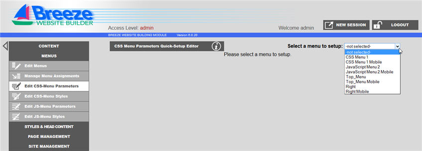
First, the menus must be reshaped to have mobile friendly buttons. To do this, go to Menus then Edit CSS-Menu Parameters. Next select the mobile menu which you would like to edit from the drop box. ***Make sure the menu selected says "Mobile" in the title.***
Once you select a menu to edit, you will be taken to the following screen:
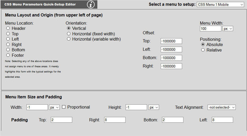
On this screen, you can adjust the orientation, positioning, size and padding of the menu and menu items. Adjust these variables to a size that fits your page and can be easily selected on a touch screen.
To change the color of the font and/or button, go to Menus then
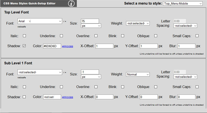
In this area the colors of the font, menu and sub menu can be changed. If further change is necessary, please see the Editing CSS page of the Breeze Website Builder Help.