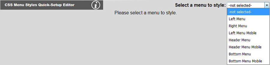
You will not be able to set the menu styles if the menu parameters have never been set. After the menu parameters have been set, you may select a menu you want to style as shown below:
You may then change your font, size, color, weight, drop shadow, etc. as shown below. Note that the browser default of underlining links will be overridden here by default. If you want your menu to have an underline, you will need to check the Underline checkbox.
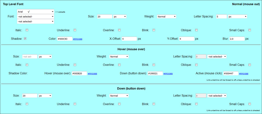
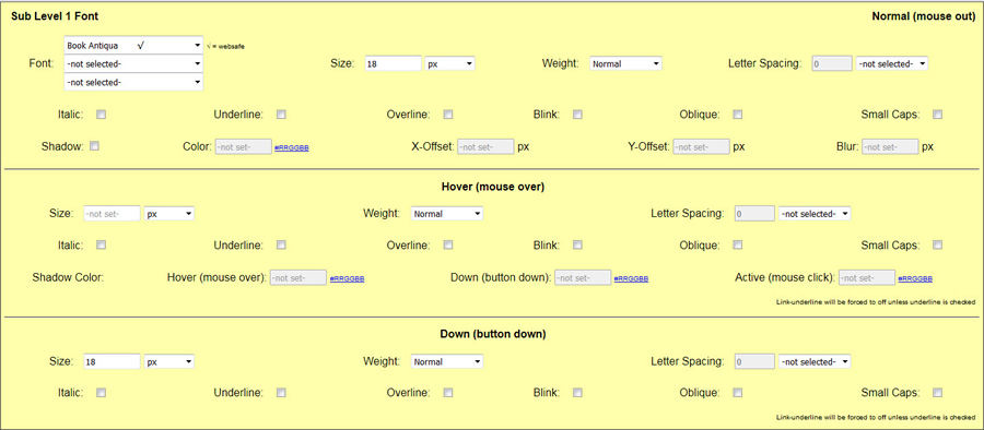
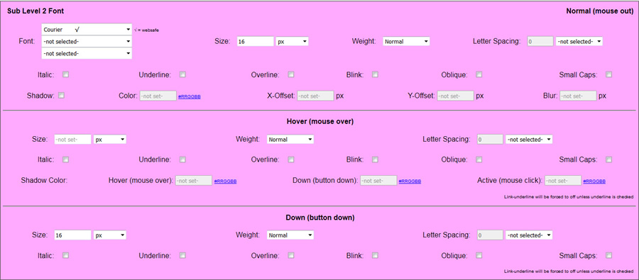
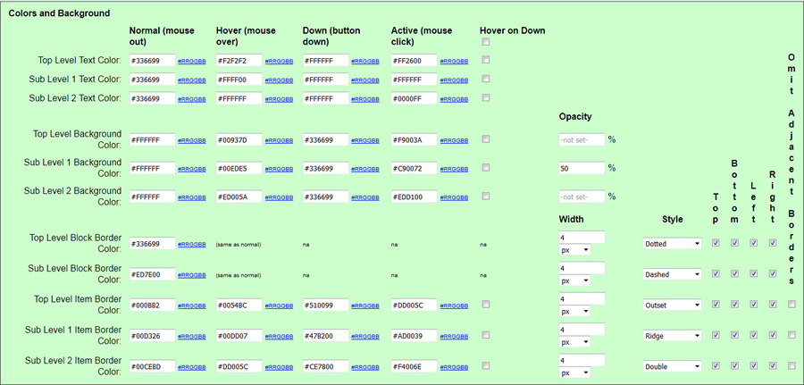
Text color, background colors, and borders and colors for mouse out (link), mouse over (hover), down (button down) and mouse click (active) events are set in the bottom section of the tool as shown above. You may turn off background color or borders by blanking out the corresponding fields. Block border refers to a border existing around the entire menu and item border refers to a border around each menu item. You may also specify which side(s) you want the border on. By default, all sides are selected. Click Update to save your changes.
Omit Adjacent Borders is useful when you want to have a border around each of your menu items, but you do not want the border to double up between two adjacent buttons. For example,the right border of one button next to the left border of the next causing the border between the two items to appear twice as thick as the top and bottom borders or the outside left of right borders of the entire menu. For sub menus, these adjacent borders would be bottom against top. Simply check the checkbox and the extra border will not show leaving only a single border.
Checking Hover on Down will cause the down menu items to have a hover state that is the same as the other normal (non-down) menu items. This allows you to create conventional desktop menus that do not honor which item's page is selected by also setting the colors of the down state that same as the normal state. You can do this for any or all levels and for text color, background color or item border color.
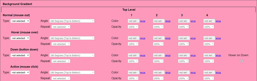
Background gradients can be either linear or radial. A background gradient will take precedence over a plain background color; however, it is a good idea to specify both to have a fallback for older browsers that do not support gradients. You may specify the angle for linear gradients. This panel allows for each of the 90 degree and 45 degree angles as well as other angles in 10 degree increments. You must specify at least 2 colors. The colors may be the same color if the effect you are looking for it to merely go from opaque to transparent. You may also specify the opacity for any of the colors you pick. This console does not allow you to choose at what percent to break in the new color. Each new color will come in as an equal portion of the gradient. You may also specify the number of times you want the gradient to repeat throughout the area the gradient is applied to. Also note that repeated gradients are calculated to give each color equal weight. Each level, top, sub 1 and sub 2 may have their own collection of gradients for normal (mouse out), hover, down and active states.