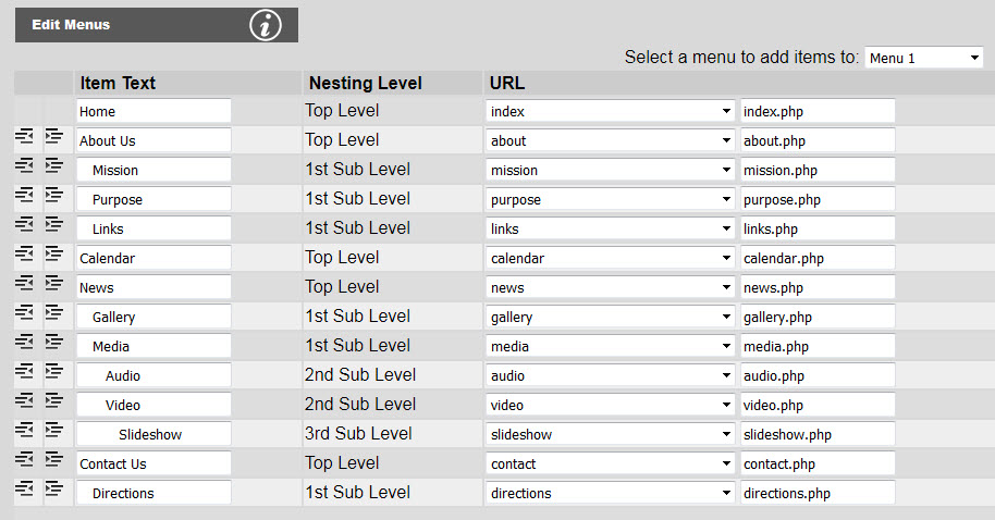
For the following examples the menu items are populated as shown below:
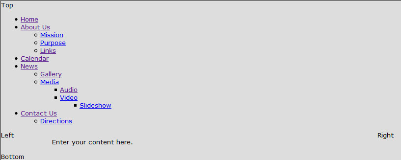
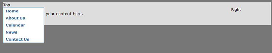
Upon creating the menu items, the menu will not look like anything but a nested unordered list:
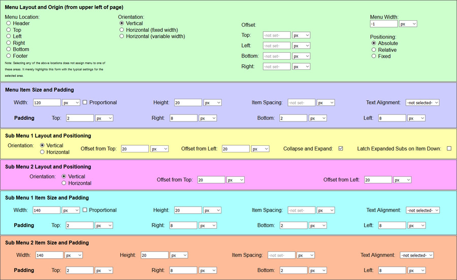
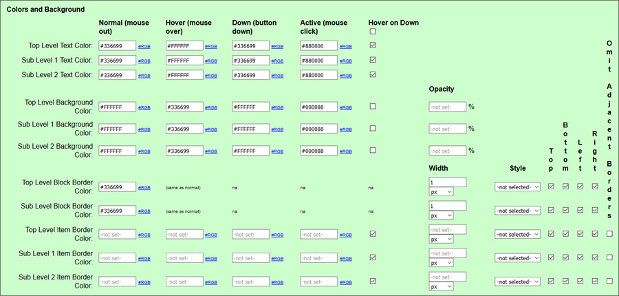
The default settings in the Edit Menu Parameters console are show below:
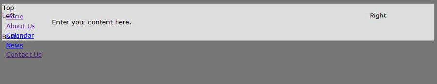
Clicking Save will result in the menus appearing as show below:
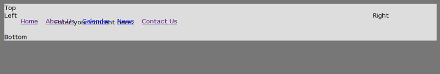
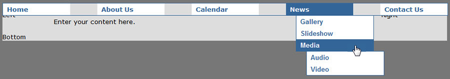
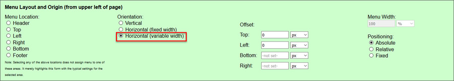
Flipping the orientation to Horizontal (variable width) will change the menu to appear as below:
As you can see, although the menu no longer has the default list item "dots" and it can be either horizontal or vertical, it still does not look like anything other than default links. To add some fonts and colors, you need to go to the Edit Menu Styles console. The default settings for menu styles are shown below:
Using both default menu parameters and menu styles you will start to see something that resembles an actual website menu as shown in the figures below:
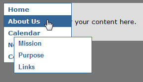
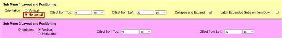
Note the gap between the "About Us" link and the sub menu starting with "Mission". This is generally undesirable because if the mouse moves to slowly between "About Us" and "Mission" the sub menu will disappear. To correct this problem, set the Offset from Top to 0 as shown below:
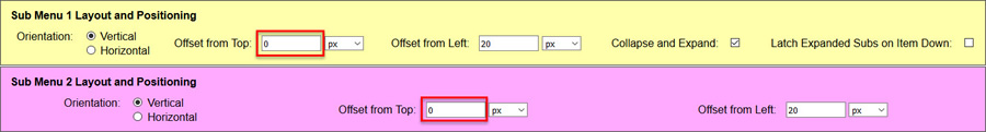
As you can see below, this causes the sub items to flow out nicely as shown below. Note that if you had a horizontal menu, you might leave the Offset from Top at 20px and set the Offset from Left to 0.
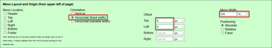
Note how the menu is not positioned all the way to the top left corner of the top div. If you want it to reference from that corner, just set Top and Left to 0. You can place your menu anywhere relative to that corner by using different numbers. You can also make your menu horizontal and have it fill the top div as shown below:
The result will appear as shown below:
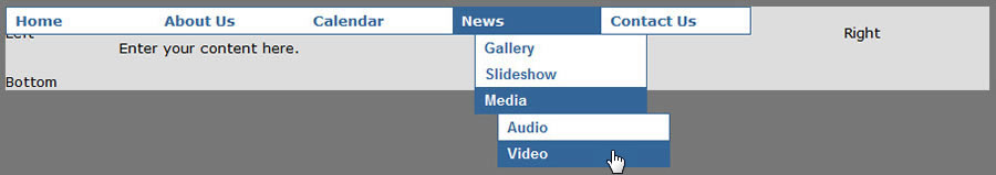
If you do not care about filling the entire top div, but would rather that the menu items butt up against each other, set it to a Horizontal (variable width) menu as shown below:
This will make the menu appear as shown below:
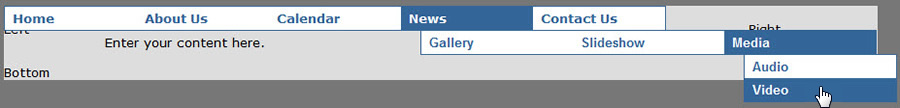
You can also set your sub menu orientation to horizontal as well:
The menu below has horizontal sub level 1 items, but sub level 2 items are still vertical:
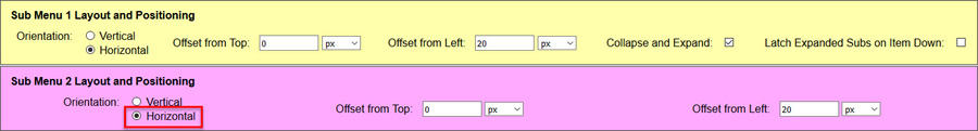
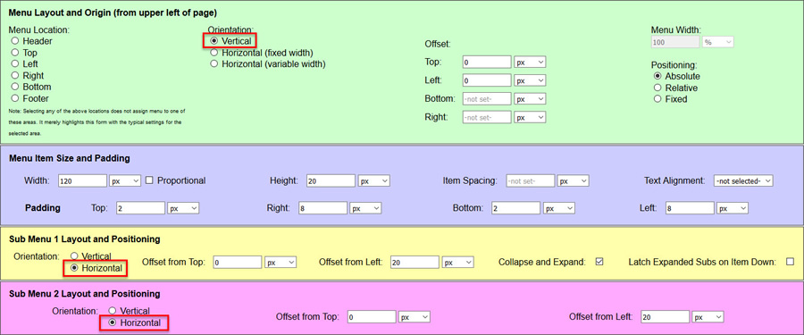
Setting sub level 2 to horizontal orientation will make both (all) sub levels horizontal:

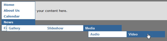
And you can also use horizontal sub menus with a vertical top-level menu:
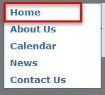
Menu item (button) down will inherit the hover styles when hovered over by default. This is how traditional menus work.
This will result in the normal state looking like any other menu item, and the hover state looking like any other menu item that is in hover state. The figures below show the menu on the index "Home" page and compares it to the "About Us" page with behaves exactly the same.
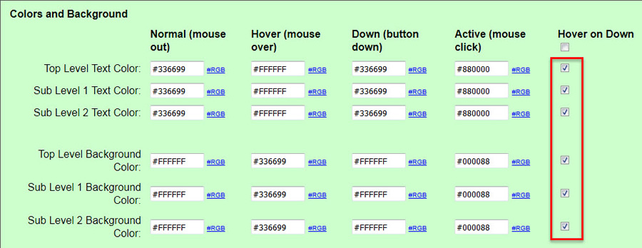
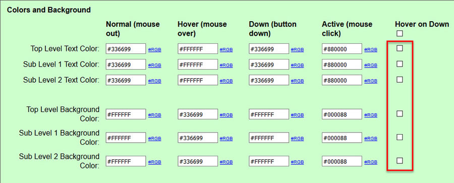
But you can also turn off the hover affects all together to give a inert looking down state.. Just uncheck the Hover on Down checkboxes as shown below:
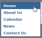
The result will look like the figure below where hovering over "Home" does to induce the hover colors as with other menu items not in the down state:

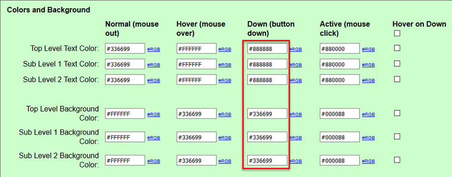
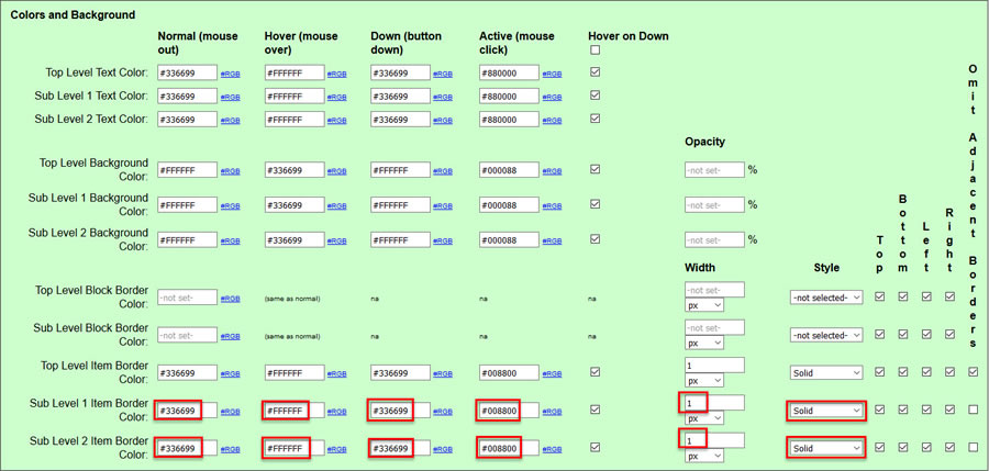
You can also set your down colors to be different than either the normal state or the hover state. Below is an example of setting the text color to gray to give an inert effect:
The result is shown below giving the "Home" button a disabled look:
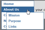
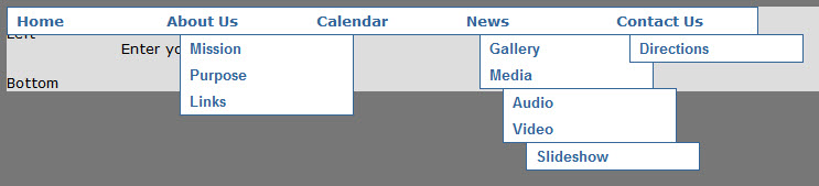
Under certain circumstances such as mobile where there is no mouse hover it may be desirable to display all sub menu items as expanded. To do this uncheck the box Collapse and Expand as shown below:

The result look like below where all sub level 1 and sub level 2 items are visible all of the time without hovering the mouse over any menu item:
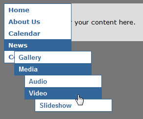
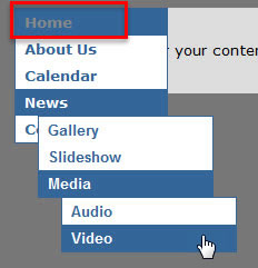
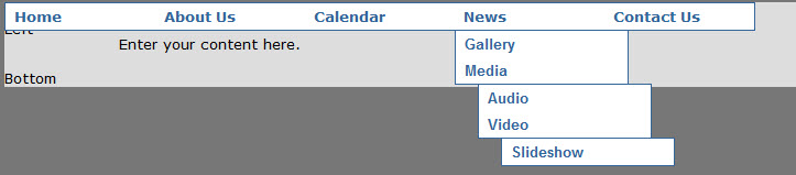
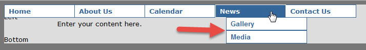
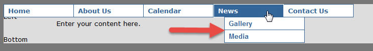
But this could easily be too unwieldy. Another approach is to keep the tree branch that has any item in it as down expanded while collapsing all other branches. To do this, make sure Collapse and Expand is checked and check Latch Expanded Subs on Item Down as shown below:

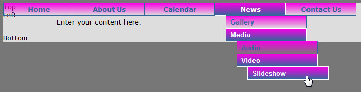
The result is shown below for any of the pages "News", "Gallery", "Media", "Audio", "Video" or "Slideshow" with default down colors:
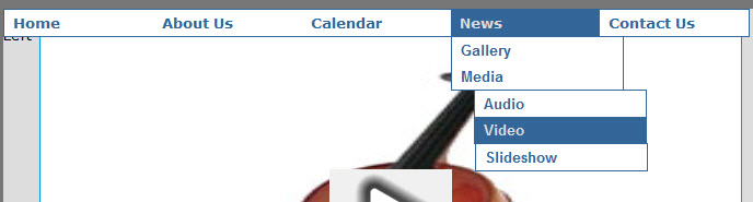
Setting down colors as above to give the "inert" look, the "Video" pages menu will show as below:
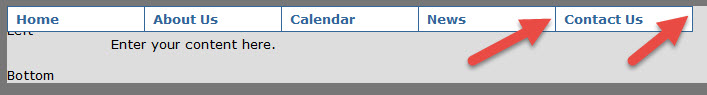
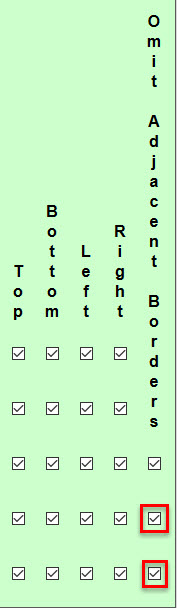
You can also apply borders to each menu item. The settings for this are shown below:
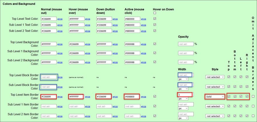
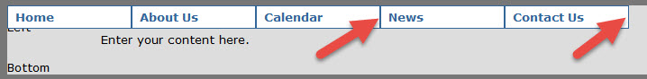
The figure below show the menu with the settings above. Note that borders between the items are actually double up making them twice as think as the outside borders.
If this is undesirable, there is a checkbox that you can check to eliminate adjacent borders. It is shown below:
Clicking the checkbox Omit Adjacent Borders corrects the border doubling issue as shown below:
You can also set borders for sub items as shown below:
Again, the result yields double-thick borders between menu items:
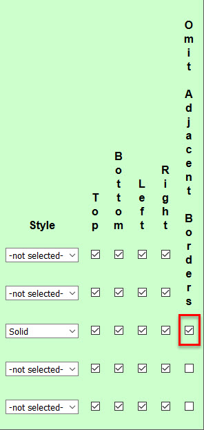
Simply use the Omit Adjacent Borders check boxes for the sub levels as shown below to correct the problem:
The result is all border between sub level items are same thickness and exterior borders:
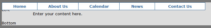
Quite often, it is desirable to have menu items that grow or shrink to fit based on the text in the item. To do this, check the checkbox Proportional as shown below:
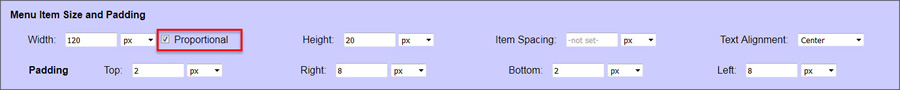
As you can see, the "Contact Us" menu item is now given more width than the other shorter-text items:
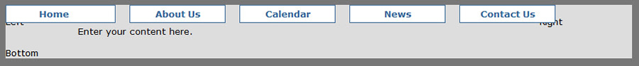
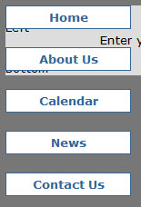
You can add space between menu items, even for a variable-width horizontal menu. Just enter the spacing for Item Spacing as shown below:
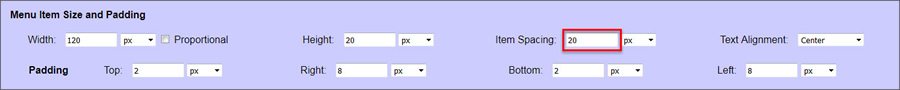
This works for either horizontal menus or vertical menus:
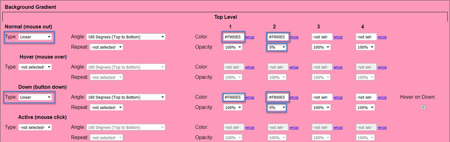
You can apply gradients to your menu items for up to 4 colors, or to transparent. These gradients can be either linear in any direction, or radial. You can also have the gradient repeat. The example below shows how to make a linear gradient that goes from a color to transparency. Note that the color entered for 1 and 2 are the same color. What is different is that the opacity is 100% for color 1 and 0% for color 2.
The result is shown below. Note that the blue on the hover items is actually a bleed thru of a solid color that was left for the hover state.